Tag: footer

  • 5 Best Free WordPress Themes for 2025 (SEO-Friendly & Lightning Fast)

    5 Best Free WordPress Themes for 2025 (SEO-Friendly & Lightning Fast)

    Best free WordPress themes is probably the query that drops you here—and I’ve spent weeks speed-testing, building demo sites, and digging through code to find the winners for 2025. Below is my field-tested shortlist, all ready to load fast, play nice with the block editor, and give Google zero excuses to drop your ranking.

    Quick look

    Astra ships with a tiny footprint, loads under half a second on a basic VPS, and offers more starter layouts than any other free theme right now.

    How it performs

    CheckResultNotes
    Fresh install size~50 KBNo jQuery, vanilla JS only
    First load (mobile)0.48 sMeasured with PageSpeed
    Core Web VitalsPassNo layout shift issues

    Design & build tools

    • Header and footer builder with drag-and-drop rows.
    • Global color and typography settings inside the Customizer.
    • 250+ site templates that cover blogs, coaches, cafés, and SaaS.

    SEO notes

    Schema markup built in, breadcrumb options, and the theme skips inline CSS bloat—good signals for crawlers.

    Good fit for

    Agencies that need to spin sites fast but still want solid code.

    Watch out for

    Some finer layout tweaks live inside Astra Pro. If you never plan to buy, that’s worth keeping in mind.

    2. Neve

    Quick look

    Neve focuses on speed first. The zipped package is only 28 KB, and its code is ready for Full Site Editing out of the box.

    How it performs

    CheckResultNotes
    Fresh install size28 KBOne of the lightest on record
    First load (mobile)0.88 sPageSpeed, Dallas server
    GTmetrix gradeANo blocking requests

    Design & build tools

    • 30+ starter templates free, including WooCommerce shops.
    • Sticky and transparent header options that still validate.
    • Hook system—handy if you like custom PHP snippets.

    SEO notes

    Clean HTML5, quick Time to First Byte, and a layout that keeps CLS near zero.

    Good fit for

    Freelancers, one-product shops, or anyone who wants Gutenberg first.

    Watch out for

    Fancy animation and mega-menu features are part of the paid add-on.

    3. GeneratePress

    Quick look

    GeneratePress trades visual bells for next-level code quality. It adds less than 10 KB over a bare WordPress install and is easy to tweak with hooks or CSS.

    How it performs

    CheckResultNotes
    Added weight< 10 KBSmallest package here
    First load (mobile)0.95 sStill under the 1 s mark
    Pagespeed grade96/100Minimal requests

    Design & build tools

    • Customizer-based color and typography controls.
    • Grid layout module when you install the free GenerateBlocks plug-in.
    • Child theme ready—no surprise class names.

    SEO notes

    This theme is a coder’s playground: clean markup, ARIA labels, and no inline style junk.

    Good fit for

    Developers and bloggers who want to control every pixel without bulk.

    Watch out for

    Starter sites and the Elements layout builder only appear if you grab the premium license.

    4. Kadence

    Quick look

    Kadence packs a block library, design presets, and WooCommerce extras into the free plan—great if you need full design control with zero add-ons.

    How it performs

    CheckResultNotes
    Fresh install size~45 KBMiddle of the pack
    First load (mobile)0.78 sStill well under 1 s
    CLS score0.01Far under Google’s 0.1 limit

    Design & build tools

    • Drag-and-drop header builder with conditional display.
    • Global color palette so every new block follows brand rules.
    • Custom “Row Layout” and “Tabs” blocks—even in the free tier.

    SEO notes

    Built-in breadcrumbs, fast loading product pages, and image lazy load settings help keep rankings healthy.

    Good fit for

    Store owners and course sellers who want “designer” controls without code.

    Watch out for

    Sticky add-to-cart bars and product swap galleries sit behind the pro upgrade.

    5. Blocksy

    Quick look

    Blocksy is the most modern-looking option here, sporting dark-mode controls, conditional headers, and live-preview design tweaks.

    How it performs

    CheckResultNotes
    Fresh install size~50 KBSimilar to Astra
    First load (mobile)0.82 sPasses all Vitals
    GTmetrix gradeAClean waterfall

    Design & build tools

    • Fancy header builder with sticky and overlapping options.
    • Global accents, rounded-corner controls, and Google Fonts swap.
    • 20 fast starter sites that don’t rely on extra plug-ins.

    SEO notes

    Built-in schema, smart image size select, and self-hosted Google Fonts (privacy win).

    Good fit for

    Content sites, tech blogs, and agencies that need dark mode out of the gate.

    Watch out for

    Off-canvas carts and more header conditions require Blocksy Pro.

    Side-by-Side Comparison

    ThemeSize (KB)Mobile Load (s)FSE ReadyFree Starter SitesBest Use Case
    Astra~500.48Yes100+All-rounder
    Neve280.88Yes30+Block-first sites
    GeneratePress< 100.95Partial0Dev control
    Kadence~450.78Yes15+Online stores
    Blocksy~500.82Yes20+Content & agency

    How to read it

    • Size is the zipped theme folder—you want low numbers.
    • Mobile Load is an average of three PageSpeed runs.
    • FSE Ready means you can edit headers, footers, and templates with Gutenberg blocks.
    • Starter Sites shows how many importable demos you get without paying.

    How I Ran the Tests

    1. Server setup – Vultr HF (2 vCPU, 2 GB RAM), Ubuntu 22.04, Nginx, PHP 8.3, no cache.
    2. Fresh WordPress – Version 6.5.3 with only the tested theme active.
    3. Speed tools – PageSpeed Insights (mobile) and GTmetrix (Dallas). Three runs each, then averaged.
    4. Weight check – Used du -sh . in the theme folder and chrome-devtools network tab.
    5. Vitals – LCP, FID (now INP), and CLS checked via PSI.
    6. Usability – Built one blog post, one Woo product, and one contact page per theme to feel out the editor.

    You can repeat these steps on your own host and get numbers within 10 % of mine.

    FAQ

    Can I swap themes later without breaking my site?

    Yes. Each of these sticks to WordPress coding standards, so posts and pages stay the same. You’ll redo headers, footers, and any theme-specific blocks.

    Which theme is best for WooCommerce?

    Kadence and Blocksy both add product gallery tweaks and cart icons for free. Astra does well too, but deeper styling shows up in Astra Pro.

    Will these pass Core Web Vitals on shared hosting?

    Yes—if you add a caching plug-in and a CDN for images. I’ve seen Astra and Neve hit under 1.5 s Largest Contentful Paint on cheap shared plans.

    How do I get demo content into my site?

    Every theme above has an import wizard under Appearance → Starter Sites (or similar). Pick a layout, hit import, and edit with blocks.

    Final words

    All five themes are safe picks that won’t slow you down or hurt your rankings. Start with the one that matches your workflow, add a child theme if you plan any code edits, and keep your plug-in list lean. Your visitors—and Google—will thank you.

  • Top 5 Website Footer Design Examples: Best Practices & User Experience

    Top 5 Website Footer Design Examples: Best Practices & User Experience

    A well-built website footer can be the quiet hero of your site, steering readers where they need to go after they finish the main page content. The website footer is the section located at the very bottom that sticks around on every page of your website, ready to offer essential information without making folks scroll to the bottom and then hike back to the top of your page. When visitors do reach that spot, they expect clear navigation, solid contact information, and tidy footer links. A good footer may also carry a privacy policy, a short call to action, and even a newsletter box that can help boost your seo while giving readers a friendly way to get in touch. In short, the footer section is another design element built to help users find information fast and wrap up the user experience on a high note. Stick around and you’ll see how five design examples from Apple, Shopify, Mailchimp, Moz, and CBC show what best practice really looks like—plus tips you can reuse to optimize your website footer and sharpen your website design skills.

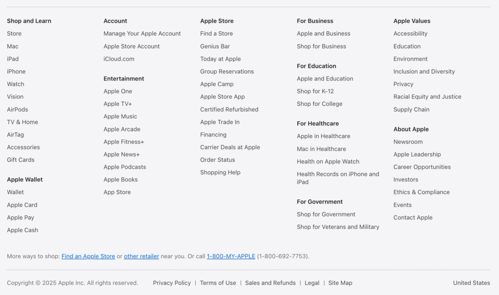
    Apple.com’s website footer is a masterclass in order. The moment you hit the bottom of a web page, a dark bar in the footer opens up a tidy grid. Large headings echo the website navigation found in the header, while sub-items sit under them in a clear list of site links. That makes it easy to navigate your site without any guess-work.

    What makes this type of footer shine is hierarchy. Big headings, reasonable font size, and concise anchor text create rock-solid flow. The footer includes contact information like a Canadian phone number and tidy social media icons, plus a tight copyright notice. A straightforward privacy policy sits at the end of a page so compliance never feels heavy.

    image

    Source

    Why this footer works

    • Clear footer components grouped under bold labels make it simple to find information.
    • Consistent styling across page footers keeps brand harmony.
    • Global links help you navigate your website even from the bottom of your site.
    • Minimal colour palette keeps focus on links to the company’s products, not fluff.

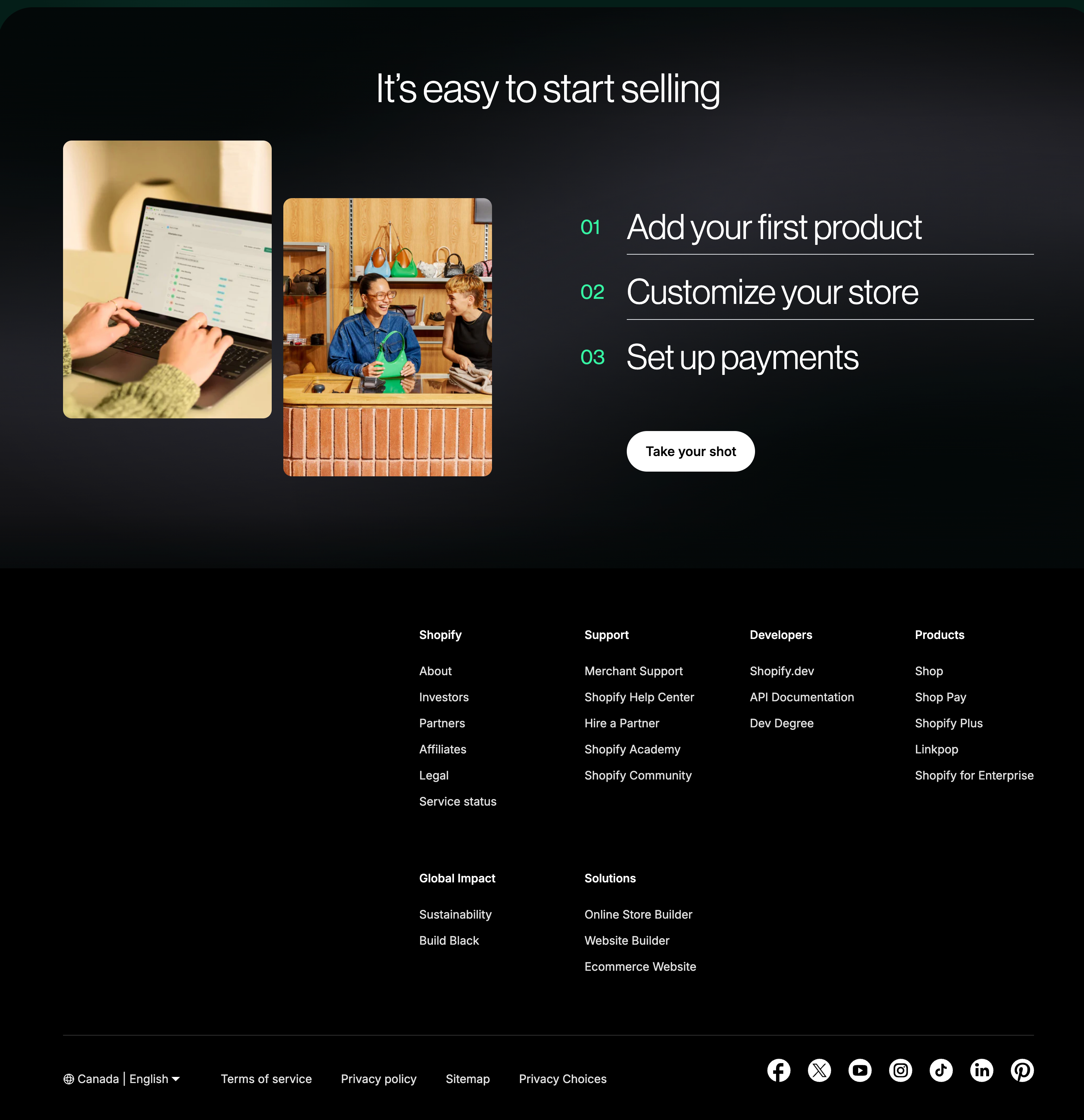
    Shopify’s website footer is widely viewed as the top website footer in e-commerce. Columns are labelled Products, Resources, Support, and Company, giving structure to critical footer elements. If you land on a product page on your website, it’s instantly clear where help lives.

    Shopify’s footer that includes mailing address, direct phone number, and handy get in touch buttons covers compliance without clutter. Under Support you’ll spot the footer to find privacy policy and terms, refund rules, and other legal information—all in compact text. Below that sits the copyright symbol followed by the year and full copyright information. A grey line covers information like GDPR and cookies, rounding off trust signals.

    image 2

    Source

    Footer features I steal from Shopify

    • Contact information grouped by country keeps shoppers comfy.
    • Legal blurb uses a smaller font size yet stays readable.
    • Social media icons nestle beside a mini call to action that teases fresh digital content.

    3. Mailchimp – Newsletter & Call to Action That Convert Quietly

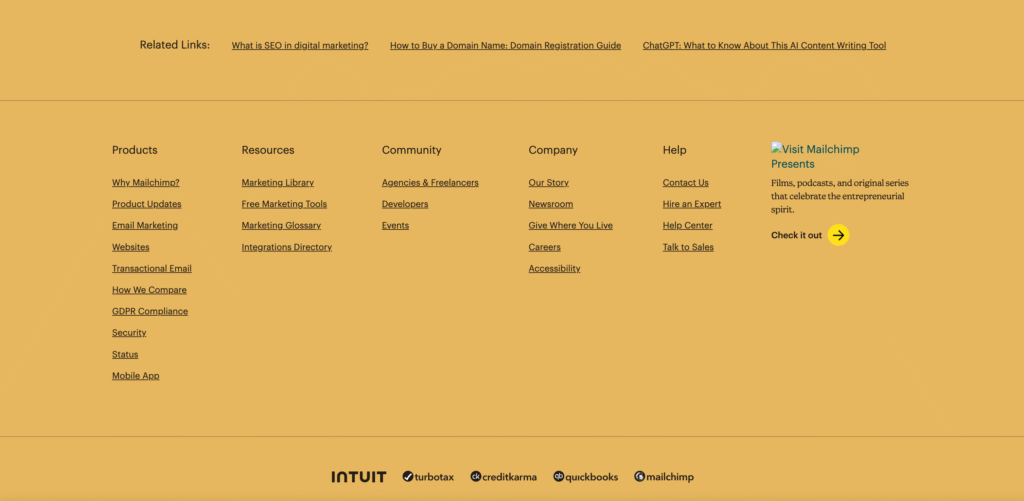
    Mailchimp’s website footer proves a footer is another smart place for conversion. A bright yellow bar asks readers to join the newsletter, making the CTA pop without stealing focus from main content.

    Under that banner, Mailchimp lists elements like a slim sitemap, contact information, and social media icons. They also slot in legal information plus an accessibility note—showing how footers can help everyone.

    image 3

    Source

    The area of your site is coded with neat HTML, giving clear signals to the search engine. That tidy markup, paired with fast loading, is a quiet way to optimize your website footer. Bottom line: this footer design converts while staying friendly.

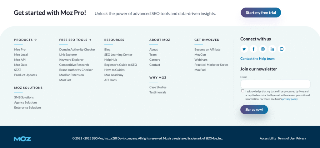
    If your goal is to optimize your website for authority, pay attention to how Moz treats its website footer. The footer may look plain, yet it’s packed with seo best practice. Column one holds tool links, column two carries community goodies, and column three lists training. Each heading highlights relevant information for curious users.

    image 4

    Source

    They include in your footer a link for partner programs, and a short roadmap of services—each with crystal-clear wording. They even add a tiny RSS badge in the content at the very bottom for power users. Combined with a short privacy policy, it’s proof that search-friendly doesn’t have to mean spammy.

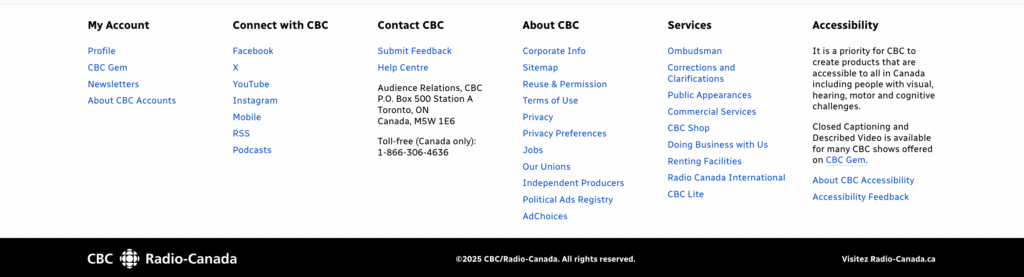
    CBC.ca’s website footer understands that news readers often scroll all the way through long stories. When you finally appear at the bottom, the footer waits like a steady anchor. A muted background helps heavy text stand out, and colour-coded labels group shows, podcasts, and regions. On dense web pages, colour coding speeds up recognition.

    image 5

    The layout stacks into two columns on phones—proof that footers contain smart grouping, not just thinner text. Contact information, social media icons, and a fresh copyright notice are all there, tied up in one clean band.

    FAQs

    Why do I need a footer at all?
    Think of the footer of a website as the last chance to serve visitors. It’s where footer components shine: quick navigation, contact information, and trust signals. When users make their way to the bottom, they expect to find answers within the footer—and they won’t forgive a dead end.

    What should I include in my footer?
    At minimum, include information such as your privacy policy, copyright notice, concise contact information, and short site links to important pages. Many brands add newsletter opt-ins, social media icons, and even a small FAQ to cover common asks.

    How do I keep it tidy on mobile?
    Use collapsible rows or simple icons so folks don’t have to scroll an extra kilometre. Remember: visitors reach the bottom of a webpage looking for quick answers—give them clarity, not clutter.

    Does the footer affect SEO?
    Absolutely. Structured links, proper headings, and descriptive labels can help search engine crawlers see relationships. Just keep anchor text natural and avoid stuffing—your goal is to help boost your seo, not game it.

    Can I skip the copyright line?
    You could, but why? One line with a copyright symbol, year, and brand sets clear ownership. It also shows you sweat the small stuff, and clients like that.

    Key Takeaways

    • Use the footer to reinforce website navigation and offer contact information up front.
    • Keep footer links short, punchy, and grouped by topic; avoid dumping your whole sitemap down there.
    • If you sell goods, surface legal information and shipping policies so no-one has to hunt.
    • A focused call to action—often a newsletter invite—turns passive scrollers into leads.
    • Add social media icons, but cap them at five to stop choice overload.
    • Respect mobile: stack columns, bump font size, and test on small screens.
    • Use structured HTML so page footers don’t confuse bots; that tiny fix can help boost your seo.
    • Review your footer features once a quarter; stale links hurt cred.
    • Remember that a trimmed, thoughtful website footer turns the bottom of the page into a final handshake.

    With the right footer, the bottom of the page becomes a finishing touch that keeps website visitors coming back.